Drawing the answer out loud.
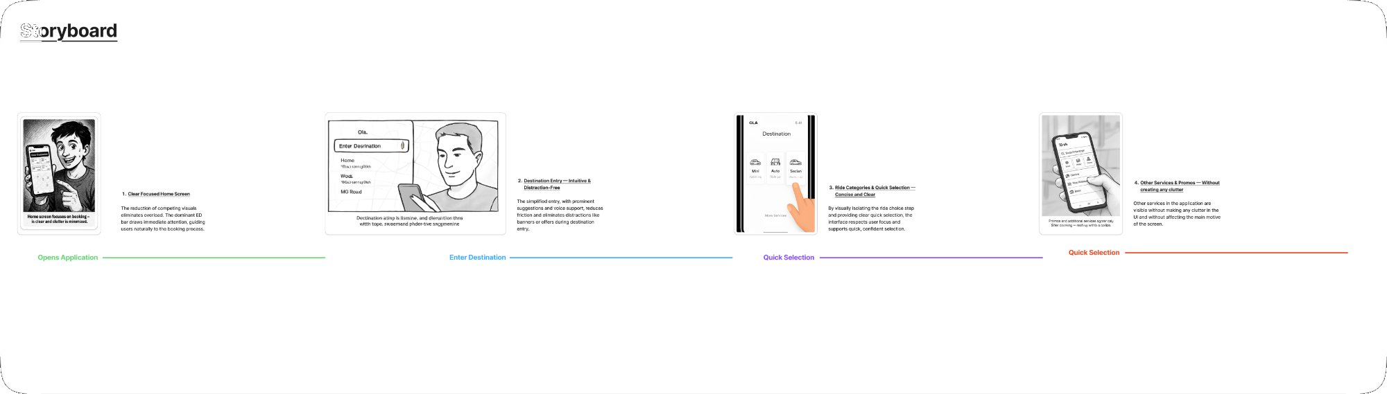
Storyboard
Plotting the flow before the first wireframe.
Wireframes
Two directions. Many iterations.
We explored With Map (spatial familiarity) and Without Map (radical simplification) — six layouts each, testing different hierarchy arrangements.
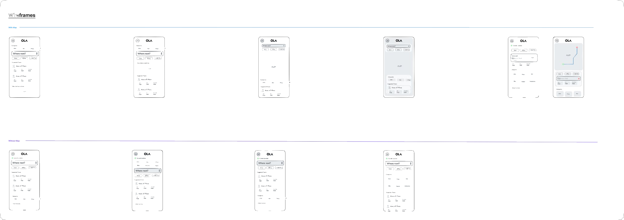
Key decision
We kept the map — but gave it a demotion.
"Without map" wireframes tested poorly — users felt spatially disoriented even though they never directly interacted with the map. A confident principle was overruled by a single usability session. We reduced the map to 30% and anchored Enter Destination directly above it. Research beats assumptions, always.
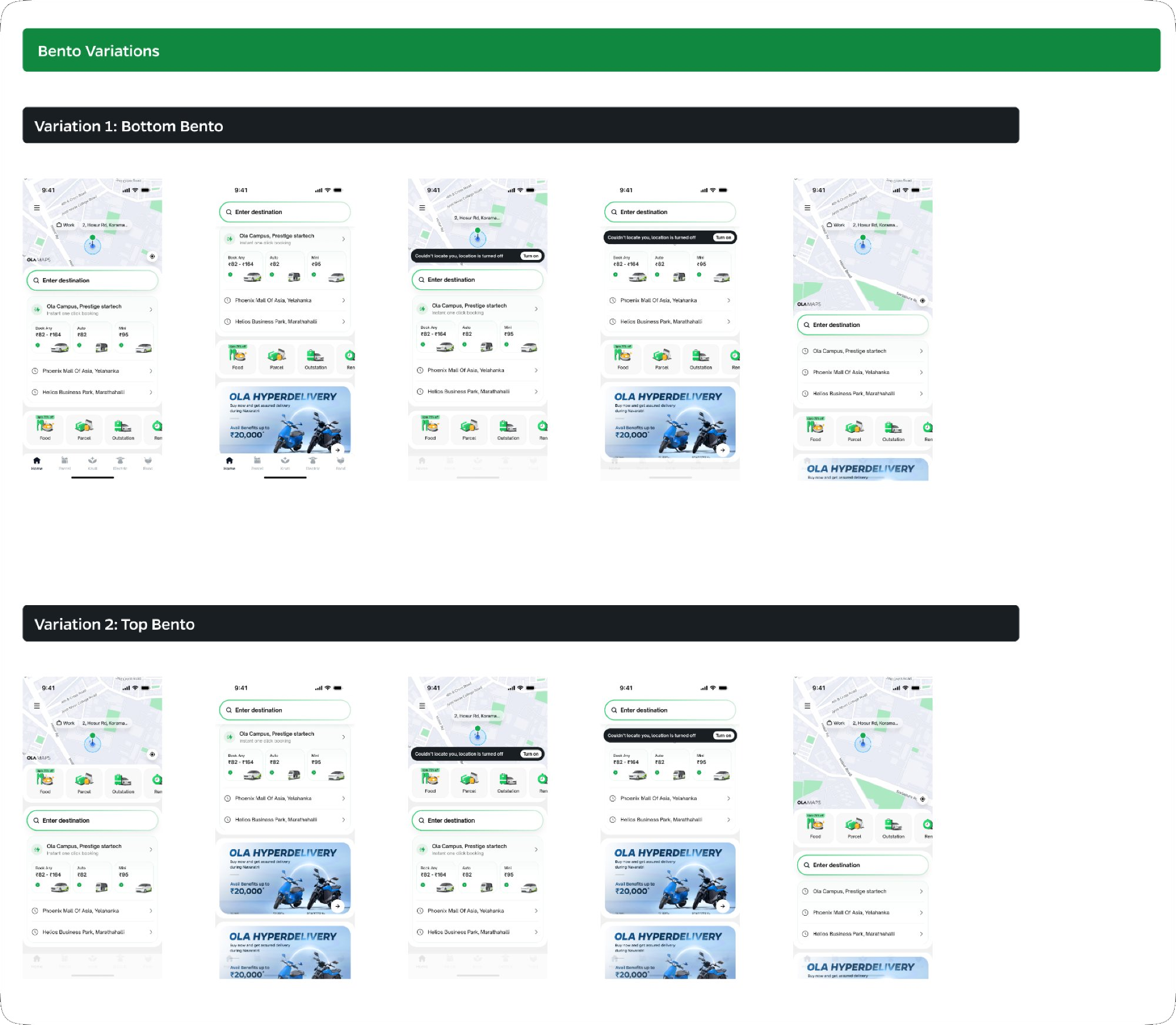
Visual variations
Bento, ED bar, ride cards.
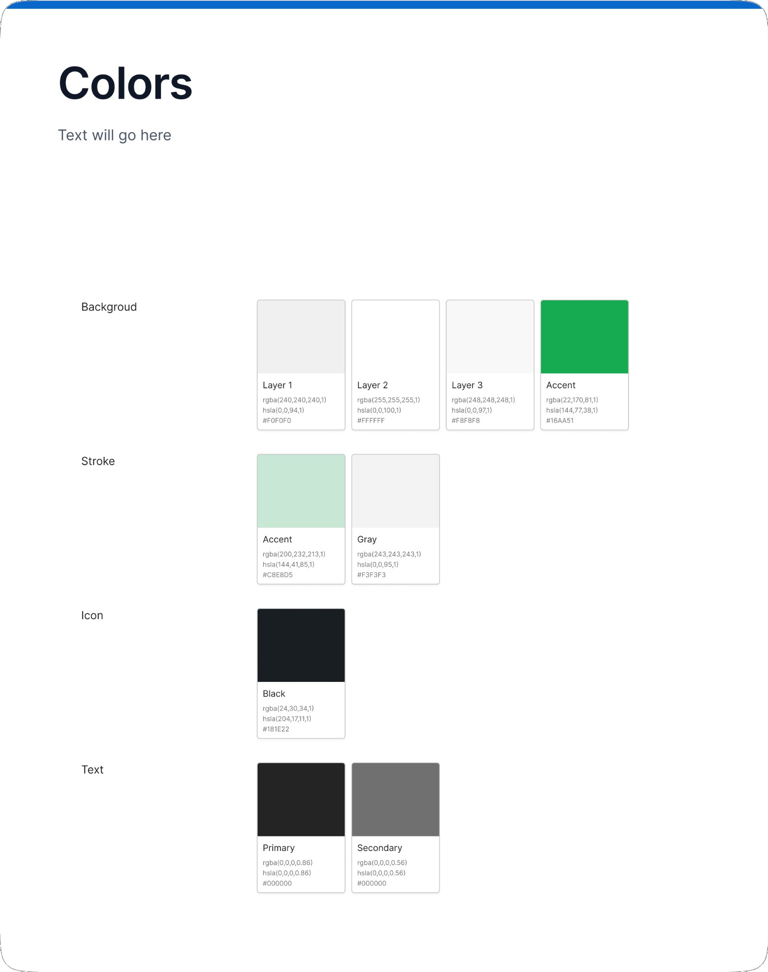
Design system
A new identity, built to scale.
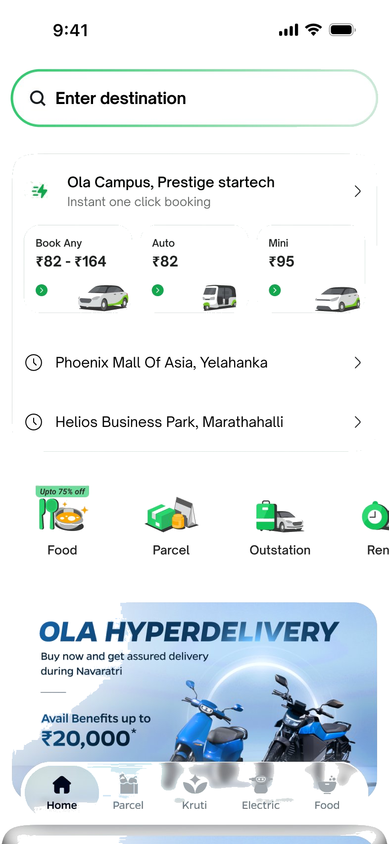
The redesigned home screen — live in pixels.
Enter Destination is the dominant first element. One-click booking shortcuts surface immediately. Secondary services live in a scrollable Bento tray. A lean bottom nav replaces the cluttered 5-tab bar.
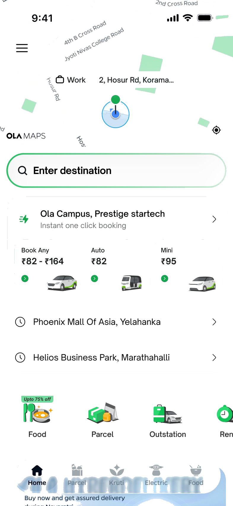
ED bar above the fold
Visible without scrolling on every device — the first element users see on open.
One-click booking
Recent destinations with live price estimates — complete a frequent journey in one tap.
Scrollable Bento tray
Food, Parcel, Rentals accessible but never competing with booking.
Fresh visual identity
New colour system, 3D icons, typography — OLA's first identity update in ten years.