Listening before designing.
Five research methods, layered — behaviour, frustration, and unmet need from multiple angles before opening Figma.
Not one method.
A full picture.
UX Audit of the existing app
Systematically catalogued every heuristic violation, hierarchy failure, and friction point on the live home screen — before talking to a single user.
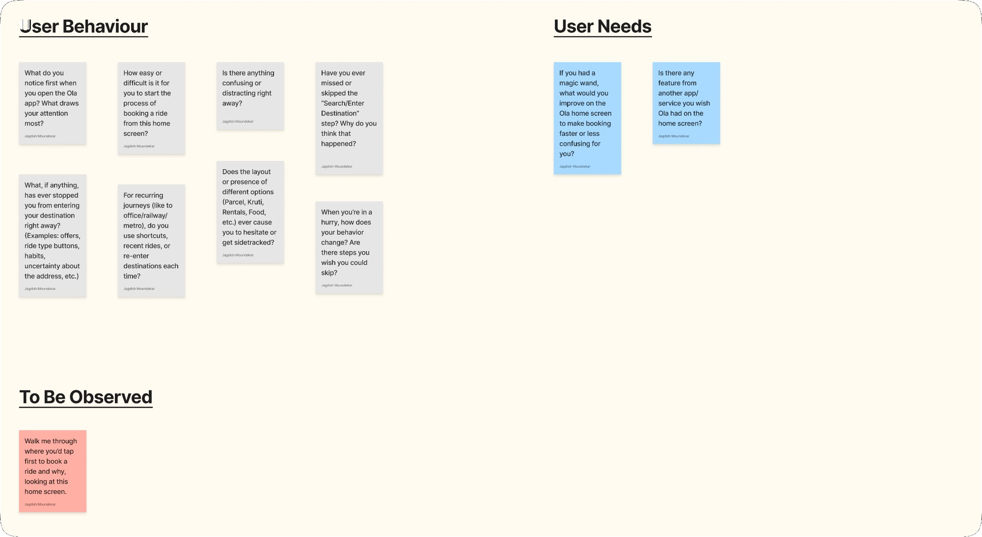
User Interviews + Structured Interview Guide
Designed a structured guide covering User Behaviour, User Needs, and To Be Observed tasks. Ran sessions with users directly on the live app.
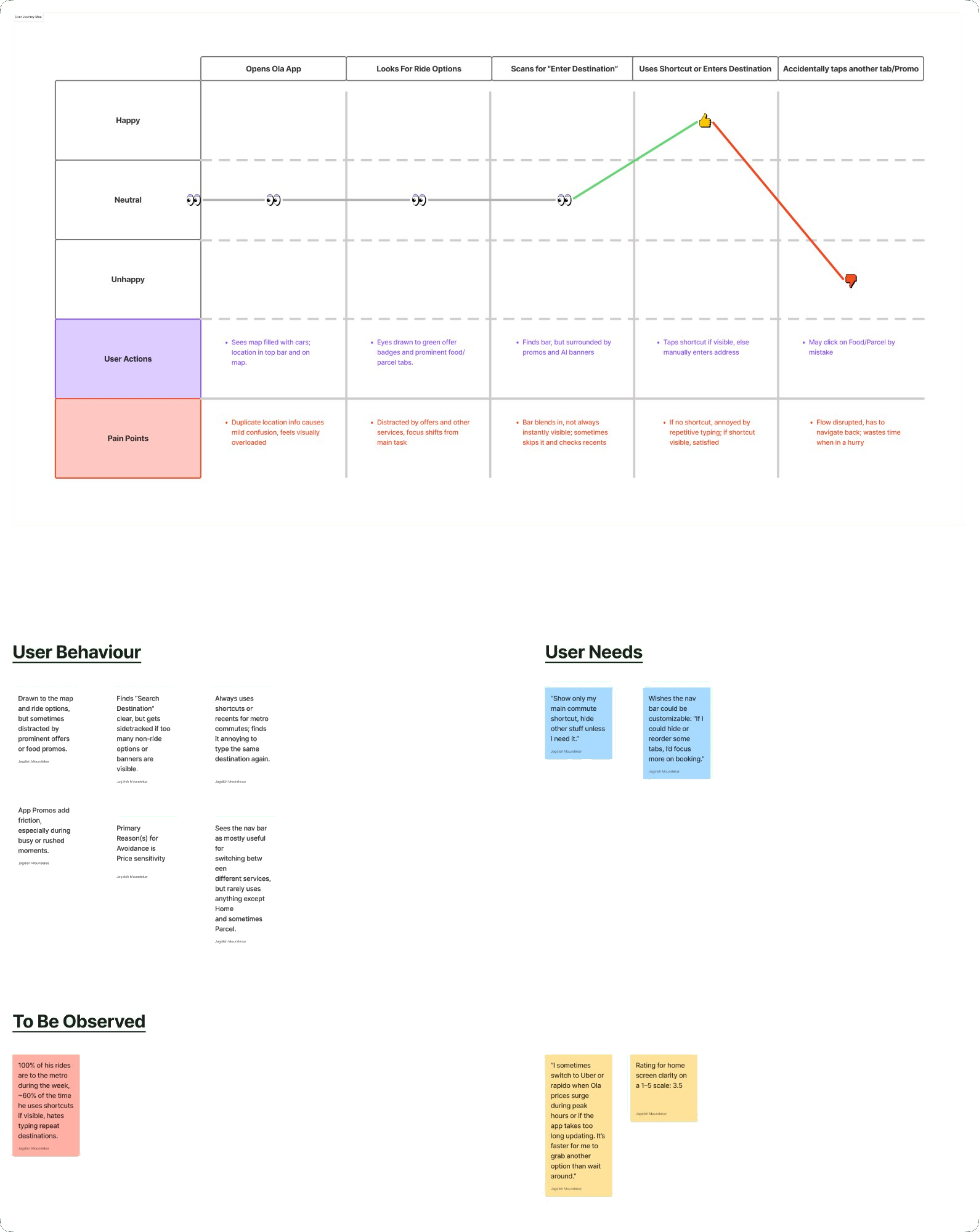
Journey Mapping — 3 Personas
Mapped journeys for Durgesh (daily commuter), Krutik (occasional rider), and Aarshad (rare user) — exposing exactly where frustration peaked and bookings broke down.
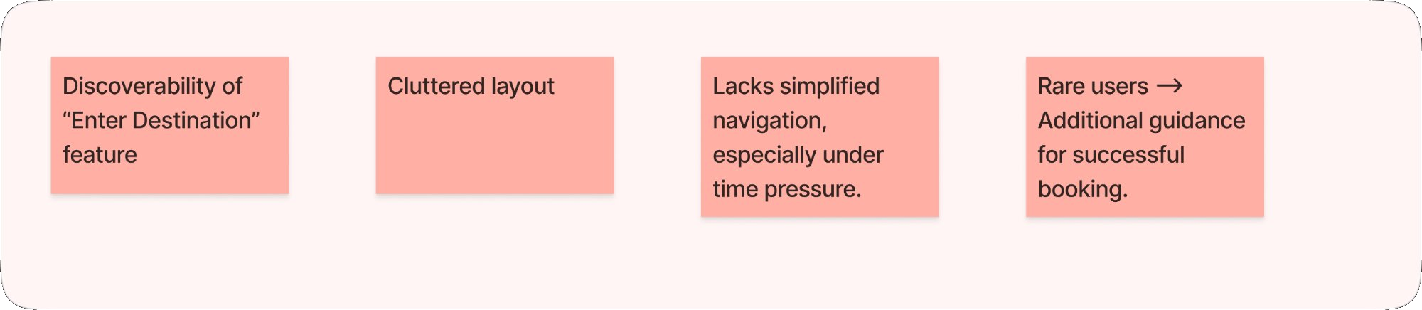
Affinity Mapping + Synthesis
All findings were clustered into four recurring themes — each became a non-negotiable design constraint for the redesign.
Usability Testing on the live app
Ran moderated sessions observing where participants hesitated, tapped the wrong element, or abandoned the booking flow entirely.
01 · UX Audit
What ten years of decisions actually look like.
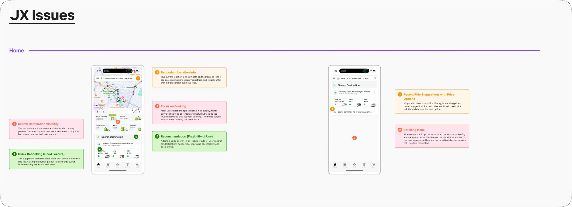
Recommendations
Issues, mapped to structural fixes.

02 · Interviews
The questions that surfaced the truth.
03 · Journey Maps
Three personas. Three different stories.
Rather than a single generic user, we mapped three real usage patterns — each revealing different friction triggers and unmet needs from the same interface.
04 · Synthesis
Four themes that shaped everything.
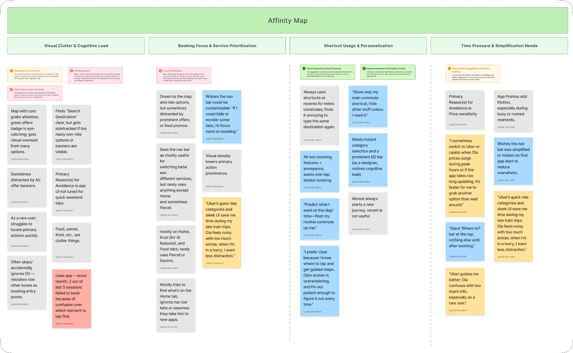
Visual Clutter
Map, banners, and service grid competed equally — "noisy" with no clear hierarchy.
Booking First
The primary task was buried. One dominant, unmissable entry point needed on open.
Shortcuts Matter
"I type the same place every day." Intelligent pre-fill and quick-book shortcuts demanded.
Time Pressure
"When I'm in a hurry I switch to Uber." Speed under pressure was OLA's critical gap.
In their own words
What users actually said.
Uber's quick ride categories and sleek UI save me time during late train trips. OLA feels noisy — when I'm in a hurry, I want less distraction.
I prefer Uber because I know where to tap and get guided steps. OLA's screen is overwhelming, and I'm not patient enough to figure it out every time.
Giant 'Where to?' bar at the top, nothing else until after booking. When I'm in a hurry, I want less distraction and less friction.
I sometimes switch to Uber or Rapido when OLA prices surge. It's faster to grab another option than wait around.