Drawing the line we wouldn't cross.
Brainstorming
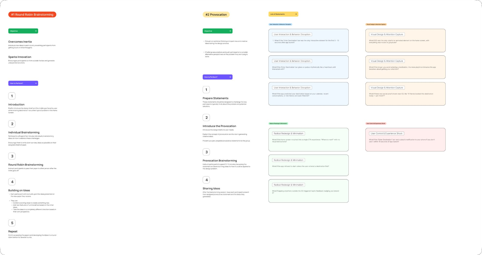
We didn't just sketch — we played.
Before any screen was drawn, four structured activities were run to break our own assumptions and push beyond expected solutions.
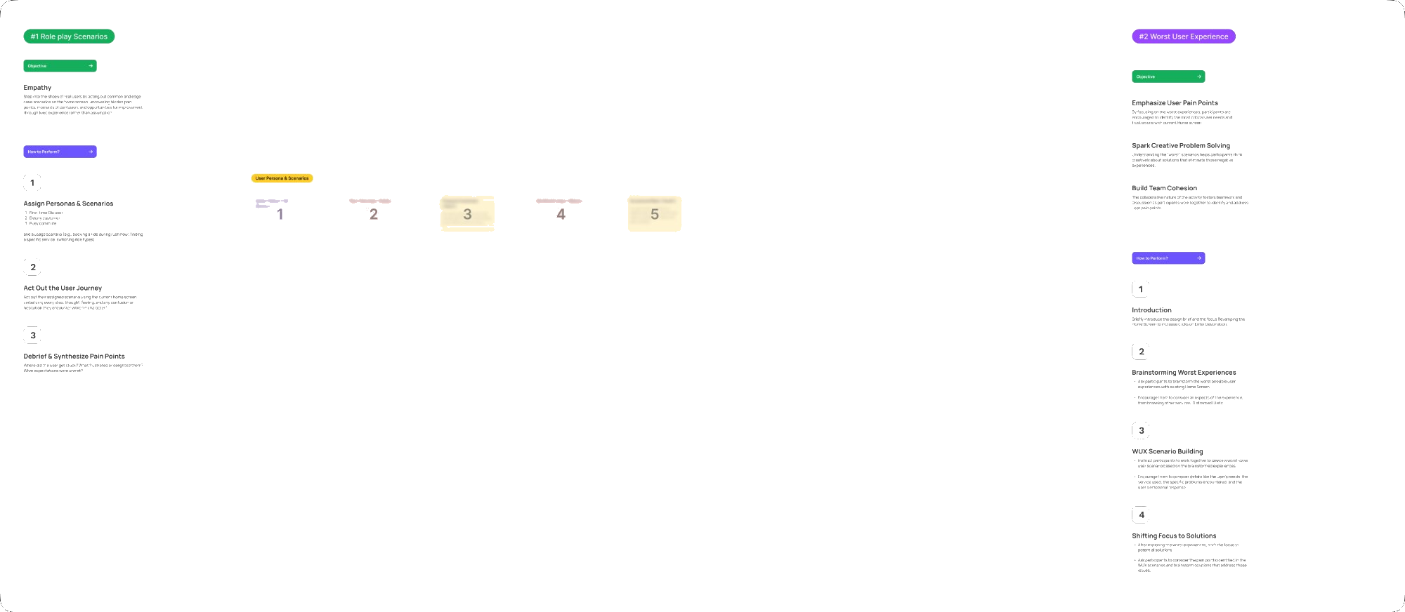
“The Worst UX activity was our most valuable session — designing the most confusing screen exposed violations we'd completely normalised in the existing product.”
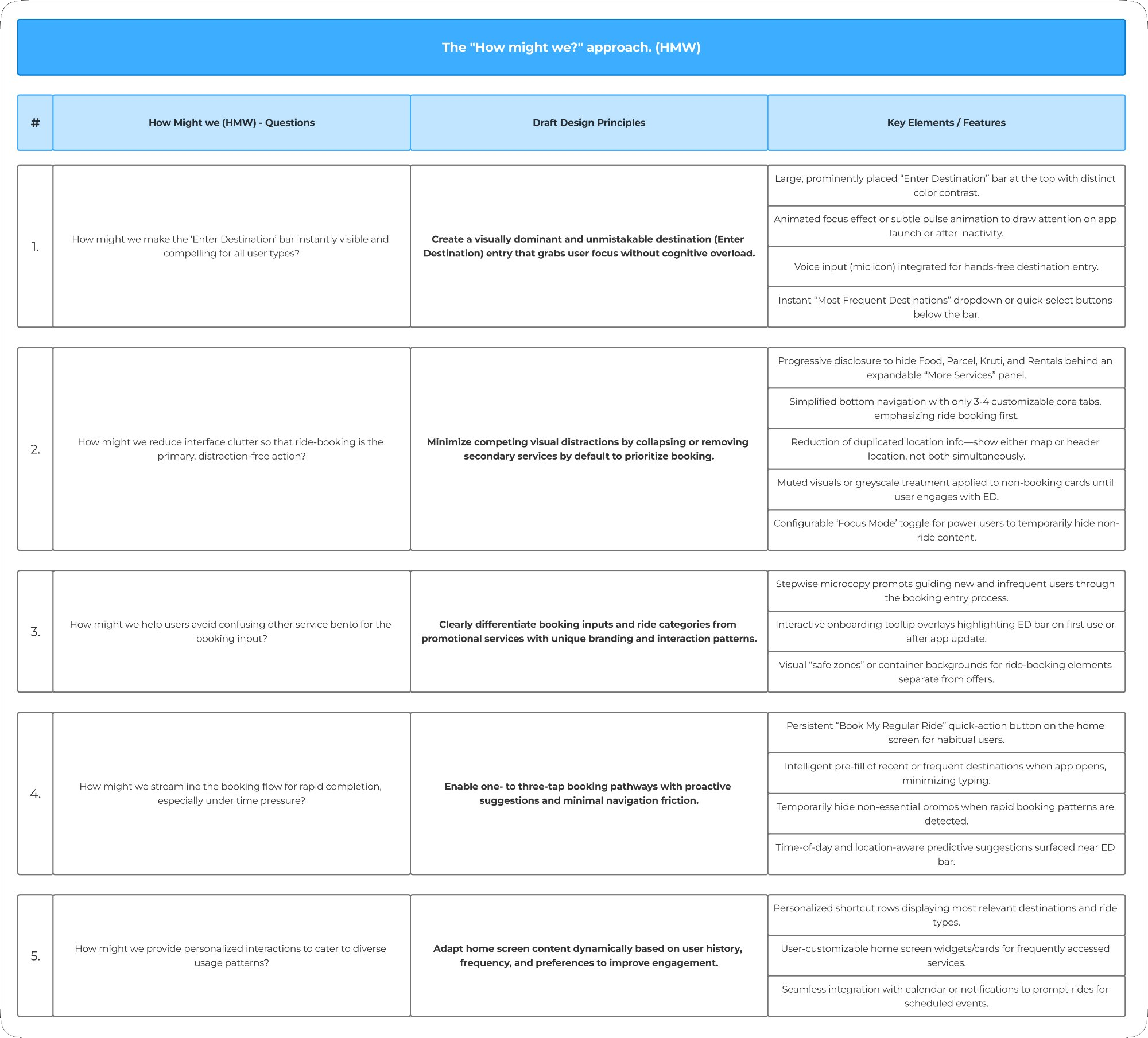
How Might We
Five questions that framed every decision.
Make Enter Destination instantly visible and compelling for all user types?
→ A visually dominant destination entry that grabs focus without cognitive overload.
Reduce interface clutter so that ride-booking is the primary, distraction-free action?
→ Minimise competing distractions by collapsing secondary services by default.
Help users avoid confusing the service Bento for the booking input?
→ Differentiate booking inputs from services with unique branding and interaction patterns.
Streamline the booking flow for rapid completion, especially under time pressure?
→ Enable 1–3 tap booking with proactive suggestions and minimal friction.
Provide personalised interactions to cater to diverse usage patterns?
→ Adapt home screen content dynamically based on user history, frequency, and preferences.
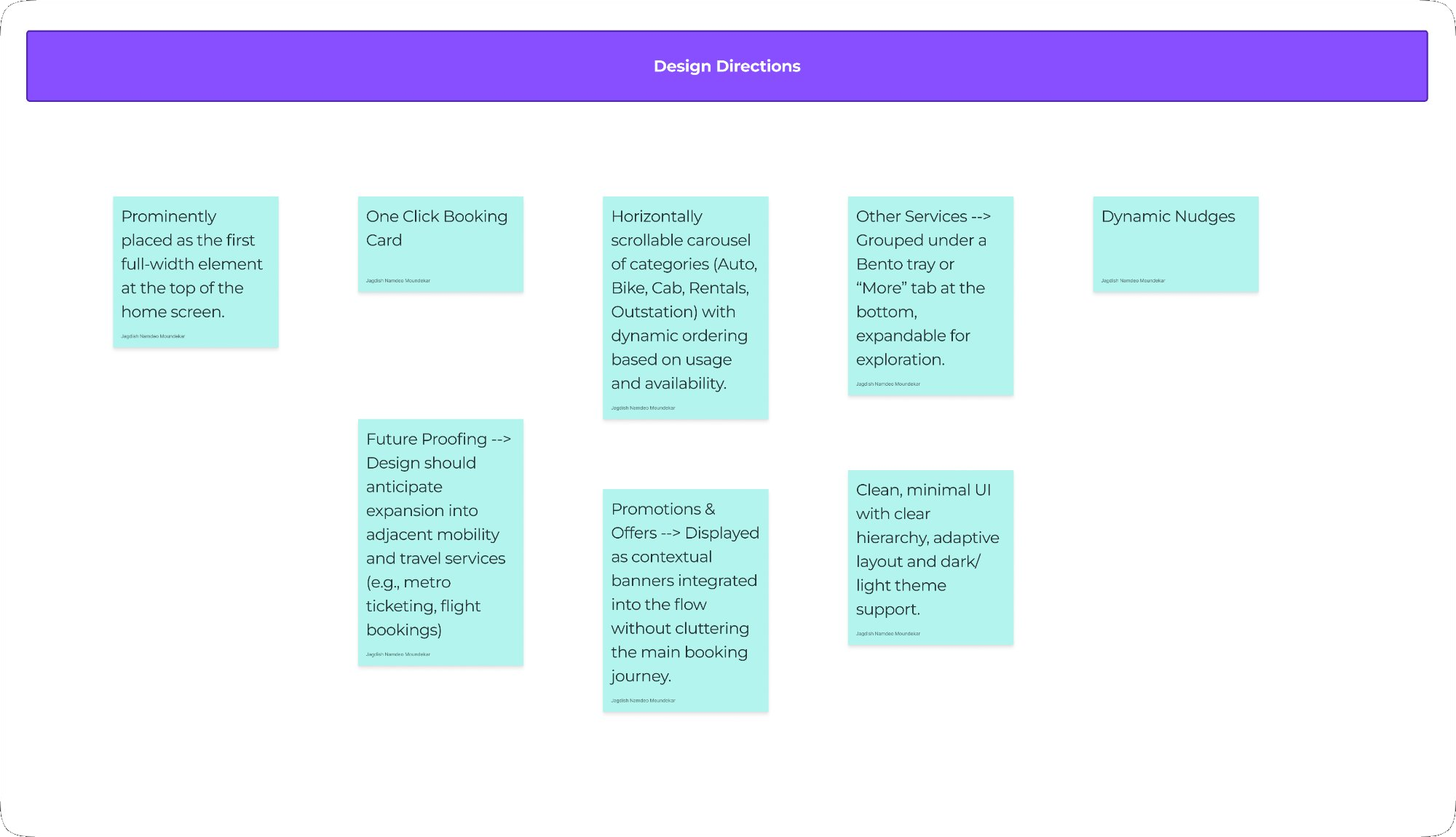
Design directions
Six bets we put on the table.
Design intent
Six principles we refused to compromise.
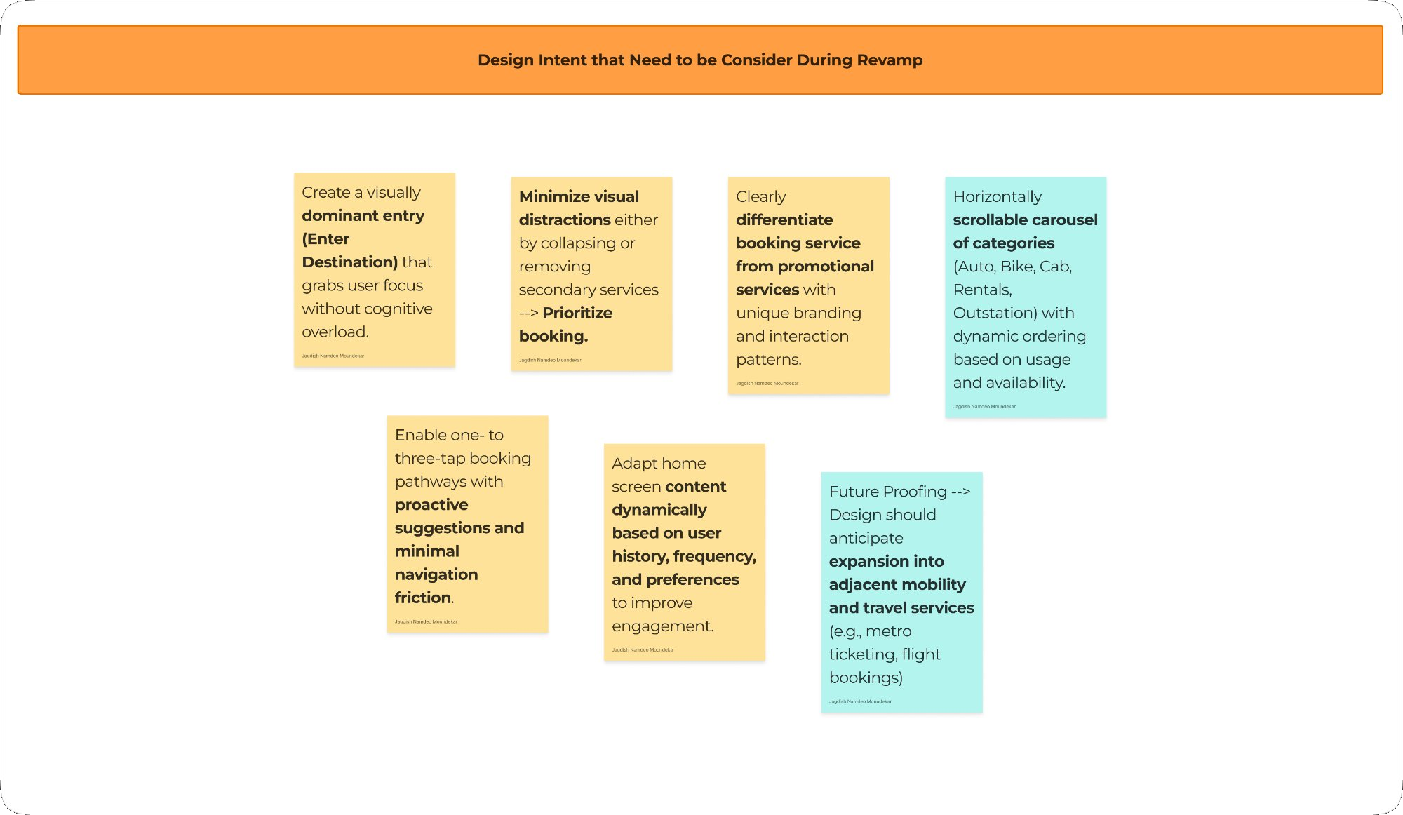
Dominant Destination Entry
Enter Destination is the first full-width element — nothing competes above the fold.
Minimise Distractions
Secondary services collapse by default. Booking is hero — everything else is supporting.
Differentiate Booking vs Services
Ride categories are visually distinct from promotional tiles — no accidental wrong taps.
1–3 Tap Booking
Intelligent pre-fill and one-click shortcuts reduce friction to the absolute minimum.
Adaptive & Personalised
Daily commuters get shortcuts. Rare users get clear guidance. One layout serves both.
Future-Proof Architecture
Metro, flights, and EV can be absorbed without restructuring the home screen.